Refining content management in Academies
Streamlining the content management foundation to improve usability, decrease reliance on support, and achieve faster time-to-market for future development.
Background
Academies, one of WorkRamp’s products, enables customer education. Admins require theming and branding capabilities to customize the learner views to create a seamless brand experience. We recently launched Custom Pages: a simple page builder that allows admins to organize learner-facing content, a major feature request for a long time. However, this feature exacerbated existing and created new usability issues, confusing our admin users and making the platform challenging to use. These problems also impacted internal teams responsible for managing and maintaining the platform, including customer support, implementation, design, and engineering. As a result, we wanted to streamline the user experience and establish a foundation to easily build future features on.
My role
I initiated and championed this project, proposing a clear vision to successfully deliver key updates. I led the design process from ideation through to final handoff to engineering. I collaborated closely with a product manager and a director who shared a commitment to solving this challenge, and worked with an engineering lead who helped evaluate feasibility and effort.
Discovery
We talked to customers, met with internal CSMs for client feedback, and reviewed support tickets post-custom pages launch to understand where admins struggled.
Key experience issues:
Confusing admin experience
Admins manage theming, pages, and content management in multiple, unintuitive locations. They struggled to understand where and how to manage content creation and platform customization (eg. default pages, custom pages, labels, tab titles, etc). The existing organization of content management tasks led to confusion about what actions to take and where to take them, resulting in frustration and increased support tickets.
Inconsistent content creation patterns
Admins can natively create three learning content types (paths, certifications, events). However, each type has a different editor, making the platform feel disjointed. Examples include different layouts, fields, and behaviors for content editing, varying UI elements (like buttons, toggles, etc.), and inconsistent error messaging (eg. relying on error prompts rather than clear UI guidance). This inconsistency increases the cognitive load for users and demands more time from design and engineering teams to accommodate these variations.
Inefficient content management processes
Admins are required to perform separate, non-intuitive steps for creating content and managing pages. For example, content is built under a default page and then arranged within custom pages, which is not immediately clear. This fragmented approach increased the complexity of managing content and pages, making the platform more difficult for new users to learn and navigate, and confusing for existing users who found it unintuitive.
Overall, the confusing information architecture, inconsistent patterns, and inefficient content management processes negatively impacted clients, and internal teams:
For end users : increased frustration around usability, difficulty navigating Academies, and a higher reliance on customer support and implementation teams to manage their accounts and content.
For implementation and customer success teams: increased time spent on education, troubleshooting and supporting users, leading to higher operational costs and delays in delivering new features.
For design and engineering teams: increased complexity in designing, developing and testing new features due to fragmented UX and inconsistent UI patterns, resulting in more frequent bugs, slower time-to-market, and hindered scalability.
Hypothesis
If the processes for managing pages, content, and theming are streamlined and simplified, then admins will be able to create and manage content more quickly and intuitively, leading to greater self-reliance and satisfaction.
Success goals
Increased customer satisfaction and self-sufficiency with less reliance on customer success teams for onboarding and ongoing support
Reduce support tickets and internal confusion regarding how to use the platform (specifically for content and page creation and management)
Faster time-to-market for new features relating to content and page management with fewer development and testing hurdles
From chaos to clarity: Transforming content management in Academies
Making it easier for both customers and internal teams to manage content, reduce support intervention, and ensure the scalability of Academies.
Our solution
established clear boundaries for content management, page customization, and theming tasks to improve user experience and increase scalability
streamlined content creation workflows to be intuitive and easy to follow for admins
updated UI patterns and behaviors across all editors to be consistent and adhere to the design system
Walkthrough of release (launched April 2025)
How we improved content management usability
After custom pages was released, we learned that while existing users were excited to have control over how their content was organized, it was incredibly confusing to do so.
“The overlap in content creation and page creation is confusing - that you can create content in certain pages, but can’t in others.”
TalkDesk
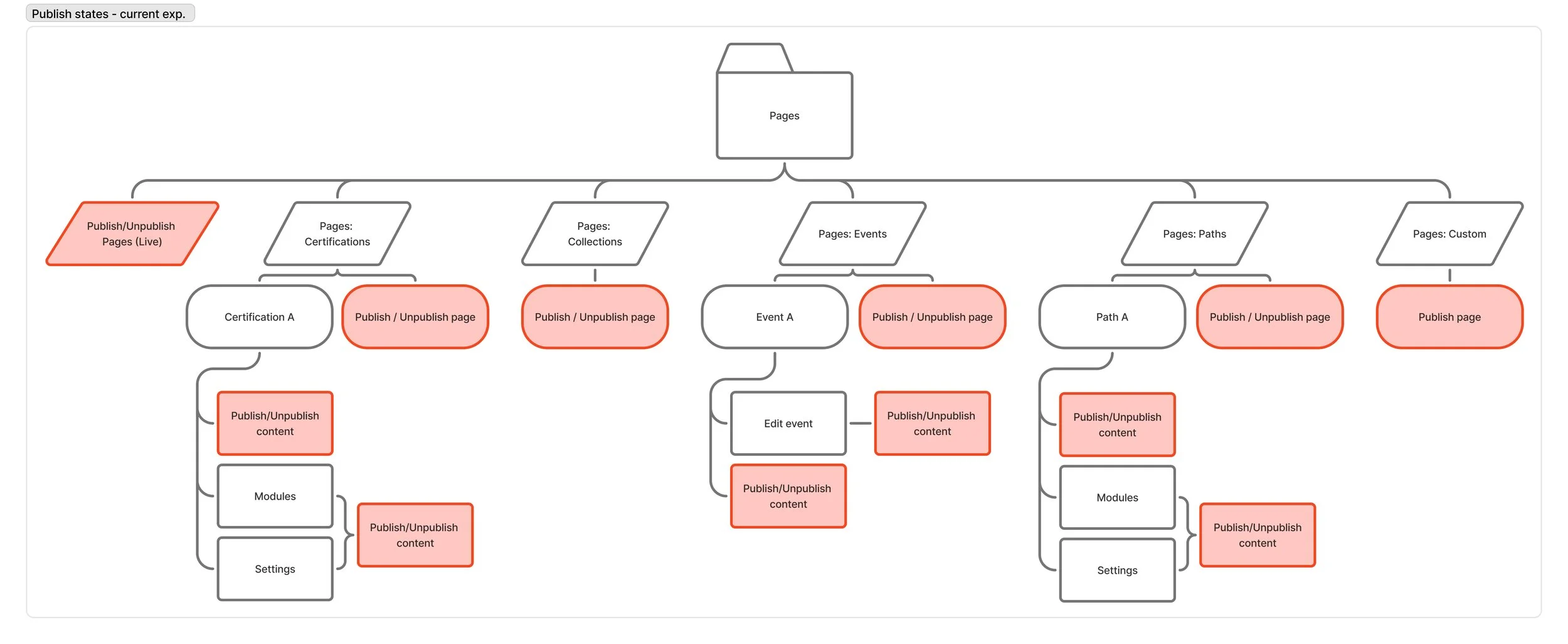
Existing usability issues became more apparent with the release of custom pages because there were no clear boundaries between theming, pages, and content. To understand how deep the problems ran, I audited the current experience and documented the locations where content tasks occurred, publish states, label override logic, and UI pattern inconsistencies. As a result, five major issues were uncovered.
Notable issues
1. Disjointed content controls
Many redundancies and inconsistencies existed between theming and pages. Text and publishing controls were found in multiple locations and varied based on content and page type. Removing the direct link to manage content caused confusion and frustration as admins struggled to find their content, increasing support tickets and reliance on internal teams to navigate the platform.

Existing, convoluted and complex IA contributing to admin confusion
2. Inconsistent page customizations
Content pages and custom pages had different customization options without clarity on why. Not only does this limit admin customization and increase cognitive load, it makes the learner-facing pages feel disjointed.


3. Ambiguous publishing workflows
The publishing experience within the content management workflow required multiple publish actions via ambiguous toggles that lacked clear feedback. Admins often believed their custom pages were live when in fact, they weren’t visible to learners, causing confusion and frustration.
4. Confusing text overrides buried in an overloaded theme editor
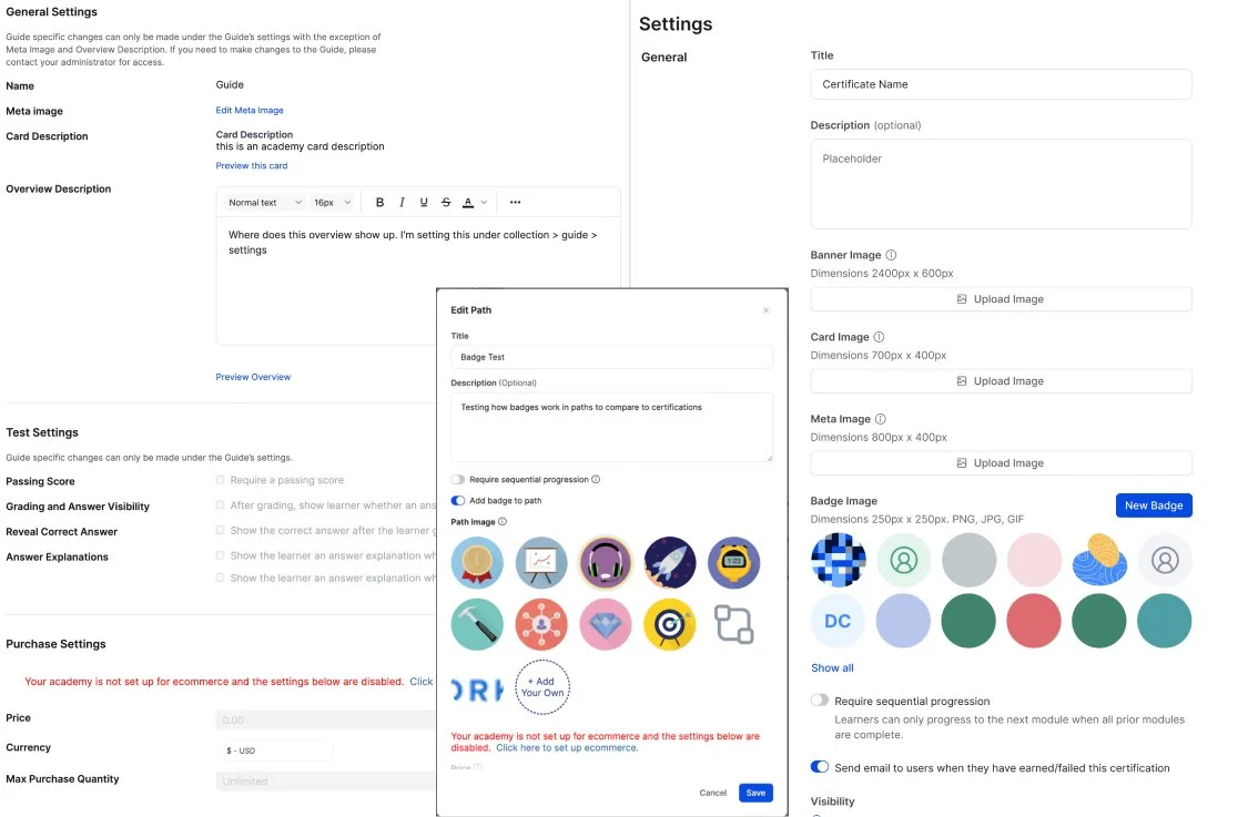
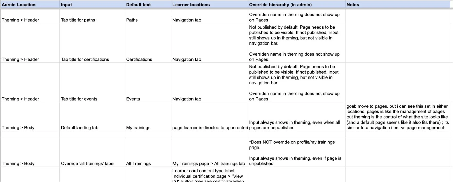
Text overrides had logic that was convoluted and interdependent on multiple fields. For example, editing a content type name (eg. Event to Webinar) changed the navigation label (in theming); if the explicit navigation label field was edited (eg. to Live Trainings), then the override did not apply. Some of these changes were visually displayed in the theming editor, but most happened without feedback, making the impact unclear. Additionally, using theming as the location for editing overrides was not ideal. It was built there for lack of a better place, limiting discovery and cluttering up the theme editor.

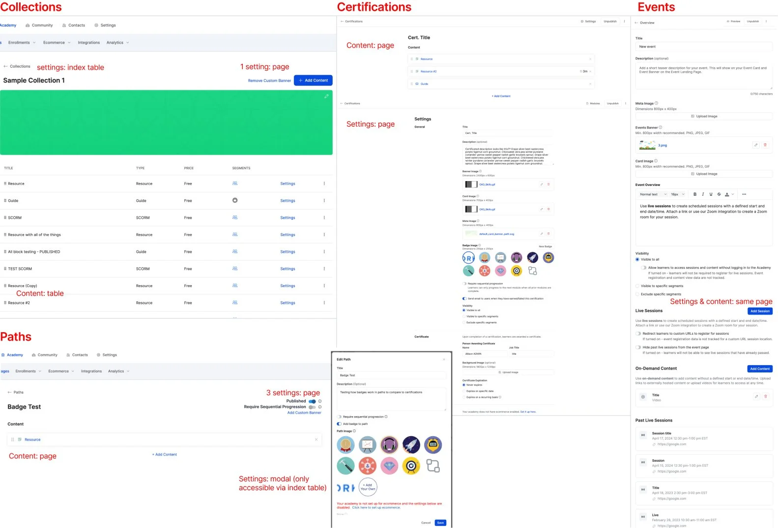
5. Fragmented content editing experience
Each content editor had different UI patterns and inconsistent interactions and functionality, increasing the cognitive load for admins and decreasing trust in the platform.
Simplicity for scalability: Proposal for a streamlined content management experience
The goal was to develop a scalable solution with clear boundaries around theming, content and pages, and streamline content management tasks to improve usability and decrease customer reliance on support teams, while increasing future development speed.
Walkthrough of the design proposal to untangle the usability issues between theming, pages and content management
To first untangle the blurred lines between theming, pages and content, I established clear definitions of their purpose:
Content: where admins build their learning content
Pages: where admins manage content organization for end-user access and discovery
Theming: where admins customize Academy look and feel
With that in mind, the solution:
streamlined the information architecture to increase discoverability and ease of use by
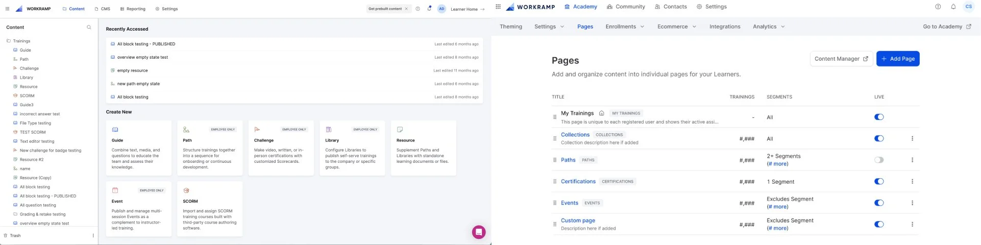
reintroducing the Content tab in the primary navigation & making it the new default when entering Academies, as it’s a primary admin action
collapsing theme editor, pages, and text overrides pages into one menu under Theming
separated content management from Pages, and made it discoverable via the new Content tab
Relocated page-specific controls from the Theme Editor to the Pages, and as a result, simplified editor organization and sharpened its focus on global theming controls
introduced a dedicated "Text Overrides" page to improve discoverability, support future scalability, and simplify the theme editor. Also, decoupled logic from page-specific fields to reduce user confusion around changes that affect the interface without clear context
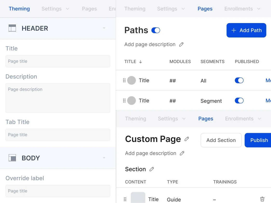
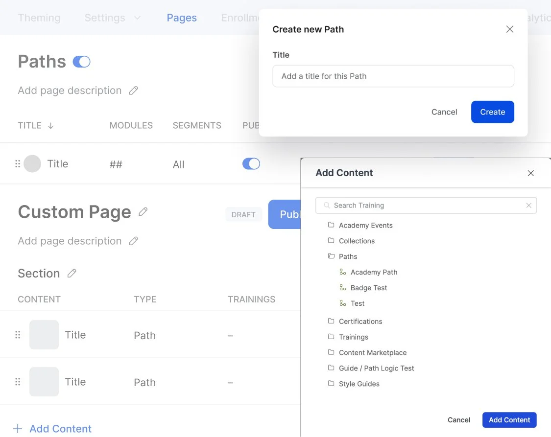
established editable “index” pages for each content type under Pages to increase admin customization controls and establish consistency with editable Custom Pages
streamlined publish states to mimic patterns used in other areas of the product to reduce duplicate actions and provide clarity into page states
unified content and page editor UI patterns to increase visual consistency in the platform
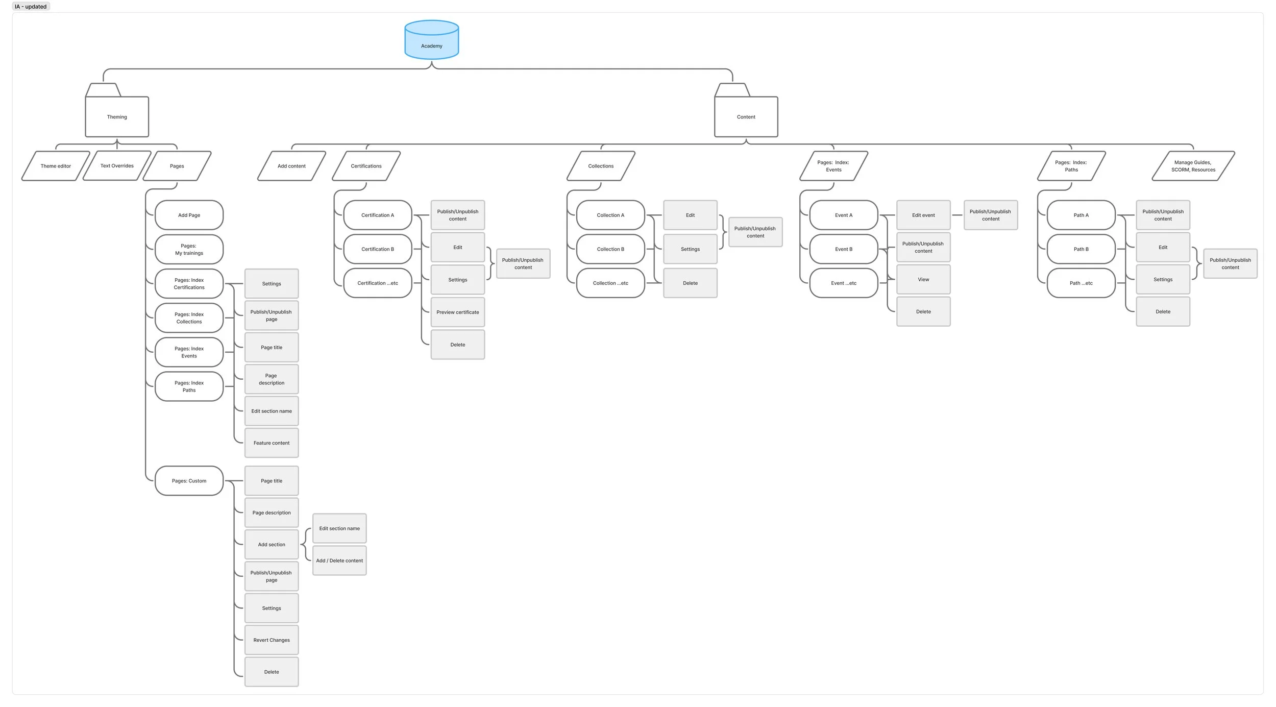
Streamlined IA for clearer navigation and content management task discovery
Balancing long-term vision with immediate deliverables
An overarching company edict was to focus on speed, releasing smaller projects to achieve faster delivery. One of the goals of this project was to establish a strong content foundation to support the development of future features. To tackle the work incrementally— delivering results quickly while working towards our future vision— I broke up the solution into five phases, from the most important and impactful updates to the nice-to-haves. By progressing through the phases, we could immediately fix the more egregious usability issues and improve customer satisfaction without hindering other feature work.
Trade-off discussions
Foundational investments vs. new features
Is it worth the time investment for this foundational work vs. focusing on net-new features? From the PDE perspective, the answer was Yes! We knew firsthand how the usability issues negatively impacted our customers, both before and after the custom pages release, and how those issues have slowed design and development over time. We knew that this foundational work would unlock faster time to market for future features, but proving this was key to persuading leadership to greenlight these updates.
On top of the usability issues, maintaining the current infrastructure would increase complexity and time-to-build from both a design and engineering standpoint. Instead of designing one consistent experience for all content or pages, we had to deliver multiple experiences tailored to the nuances of each editor. Additionally, past attempts to add new requested features, like recommendations and tags, stalled because of UX and codebase complexity.
By unifying the experiences for content and page management, we could reduce design’s time-to-execution by up to 75%. With distinct areas for content management and customization, we would have intuitive locations to slot in new features like recommendations, tags, carousels, and more - a key goal for the v1 solution. Engineering-wise, rebuilding the content foundation with system components and reducing code complexity would also increase the speed of output.
Through stakeholder reviews, we proved to leadership that this investment was beneficial, positively impacting customers and internal teams, and secured a spot on the Q1 roadmap.
Two content managers in two platforms
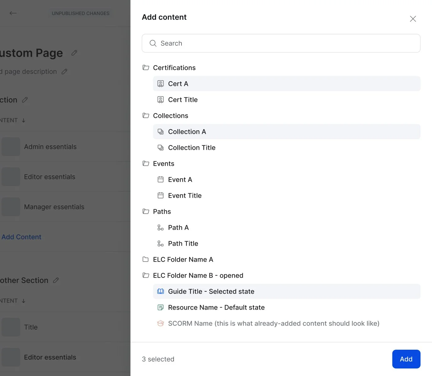
One long-standing issue with Academies is that there are two content managers. One exists in the Academy itself (and was impacted by this project), and a second in our Employee Learning Cloud (ELC) product. Admins create Guides and Resources in ELC, and then add those to content created (eg. a Path) in the Academy. Not only are admins creating content in two separate and distinct platforms, but there are no other crossovers between the two, making the experience jarring and confusing.
“It’s confusing that you create the content in ELC and then pull it into CLC.”
12Twenty
ELC vs Academies content editors (post-Custom Pages launch)
This project raised the question: should we migrate Academy ELC content into the Customer Learning Cloud (CLC) to fix this source of confusion instead? The level of effort to solve this is high - the codebase is complex and requires heavy refactoring, and it would take more than 2 sprints to accomplish (compared to the estimated effort for this project). Additionally, there was no intuitive area in the product for content management. We’d need to design and build a new experience, increasing the effort and exacerbating the existing usability issues.
Mainly due to the high effort a migration would take, it was agreed upon to proceed with this project first. This way, the usability issues are solved, content is discoverable, and there is even an approach for structuring folders, a requirement for that body of work. If a migration occurs, the user experience portion already exists and can be added in without disrupting admin workflows.
Final solution
After I shared my initial proposal with the product manager and director, we worked with the engineering lead to investigate the level of effort and time required to complete the proposed scope.
After many rounds of discussion with our PDE team and leadership, most updates listed in phases 1-3 were greenlit for development.
Phase 3 options for reorganizing theme editor sections and moving Event user data into Enrollments were postponed to post-MVP execution due to low impact and strict timelines.
We also discussed punting on the content editor UI updates, but since these changes would make future feature development faster, and to reduce admin thrash with all of the content/page updates, it was prioritized for the MVP.
Phases 4 and 5 (content search and folders) were not explored due to complexity, effort, and low impact (in the immediate term).
Launch
Development started in February 2025 while I was on maternity leave, and was released in April. While I left WorkRamp by this time, I heard from my PM partner that customers who got early previews were happy with what they saw initially and we’re excited about the override updates!
Additional quality of life improvements
As much as I would have loved to fix every inconsistency, we couldn’t do it all. I created 4 sand projects, UX tickets included, to be tackled when the team had time. (A sand is feature work that requires 1 week or less to launch). These updates focus qualify of life improvements, including:
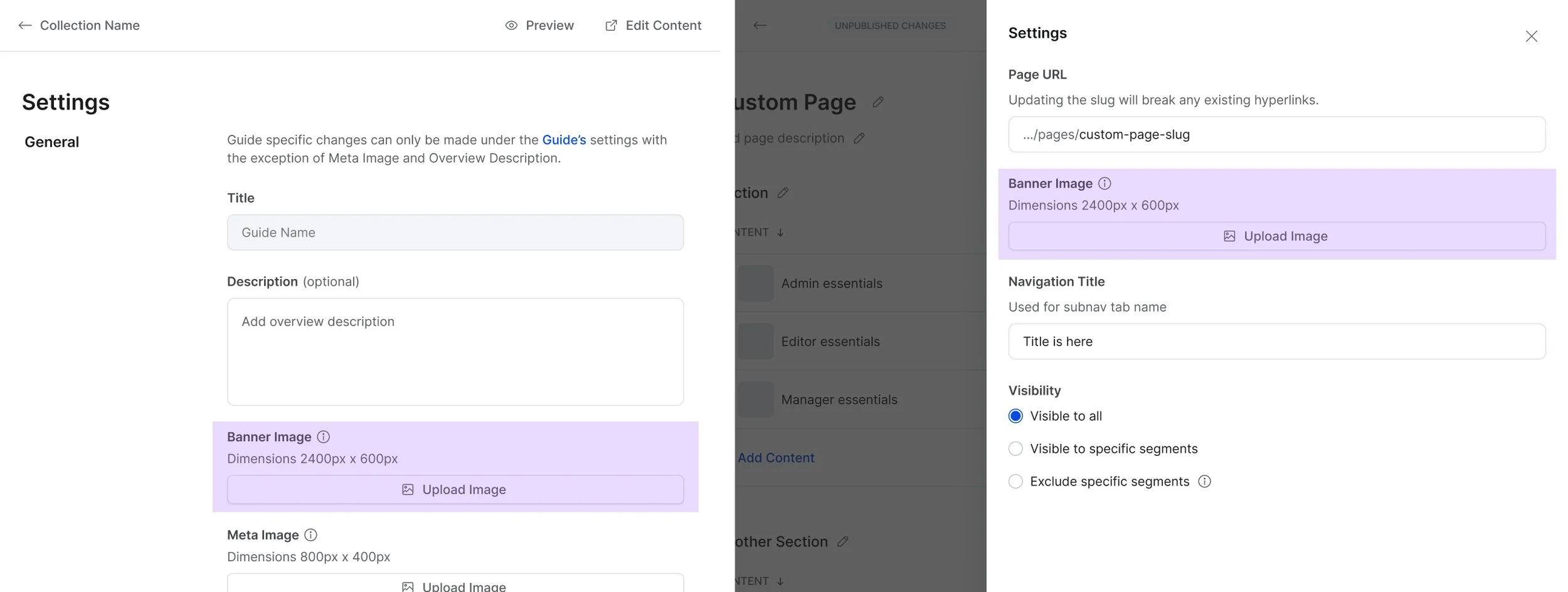
Add banner image override for guides, index and custom pages
Currently, the Background image set in Theming controls the hero image for all pages. It can be overridden for most individual content types, but it can’t be overridden for a guide, the content index page, or any custom page, limiting customizations for admins.
Add Preview option to individual content pages
To preview Academy content as a learner, admins are required to log into the Academy or navigate to the learner view to see it, which is cumbersome and unintuitive. Additionally, this feature is available when creating guides and resources, making the editing experience more inconsistent.

Update Guide/Scorm/Resource settings pages to align with system components
These settings pages use outdated UI patterns that do not align with the rest of the platform, making the experience feel disjointed and decreasing user trust.

Update content picker modal to drawer (to match ELC libraries pattern)
The current content picker is cumbersome. Content discovery is hindered in the modal, especially when there is a long list, and the modal does not align with system components, requiring more time to complete a frequently performed task.