Crafting a flexible report builder
Improving the reporting experience by enabling admins to access, manipulate, and share data easily to measure program performance.
Background
WorkRamp is a Learning Management System, and the Academies product supports customer and partner education. Customer enablement empowers customers to use a product successfully through programs like onboarding, product training, or certification programs, leading to increased loyalty, satisfaction, and advocacy.
A key component in running a successful enablement program is reporting. Admins need comprehensive data to showcase the value and ROI of enablement to stakeholders. However, the state of reporting in Academies was limited, and in turn hindered the ability to understand the impact and value of an enablement program.
My role
I led end-to-end design for this project, balancing long-term vision with near-term execution to consistently deliver incremental user value. I partnered closely with PMs and engineers to shape scope, assess feasibility, balance tradeoffs, and ensure alignment. Midway through, I also onboarded a new PM, helping them get up to speed and maintain momentum.
Objective
Improve the reporting experience enabling admins to easily measure program performance and share data with stakeholders.
Metrics
Primary: Increase customer satisfaction and retention
Secondary: Reduce reporting as a closed/lost reason for prospects, specifically in competitive deals
The project aimed to close out feature requests - as 8 of the top 10 for Academies focused on reporting, and impact renewals because of new reporting functionality as directional indicators customer satisfaction and retention.
Walkthrough of final, live report builder solution
Developing a flexible custom report builder
Who are Academy admins?
At a very high-level, Academy admins build trainings for their own customers or partners to achieve business outcomes.
For example, WorkRamp’s own enablement program creates trainings for their users to better utilize the platform to increase their ROI, and as result, impact WorkRamp's business goals like retention.
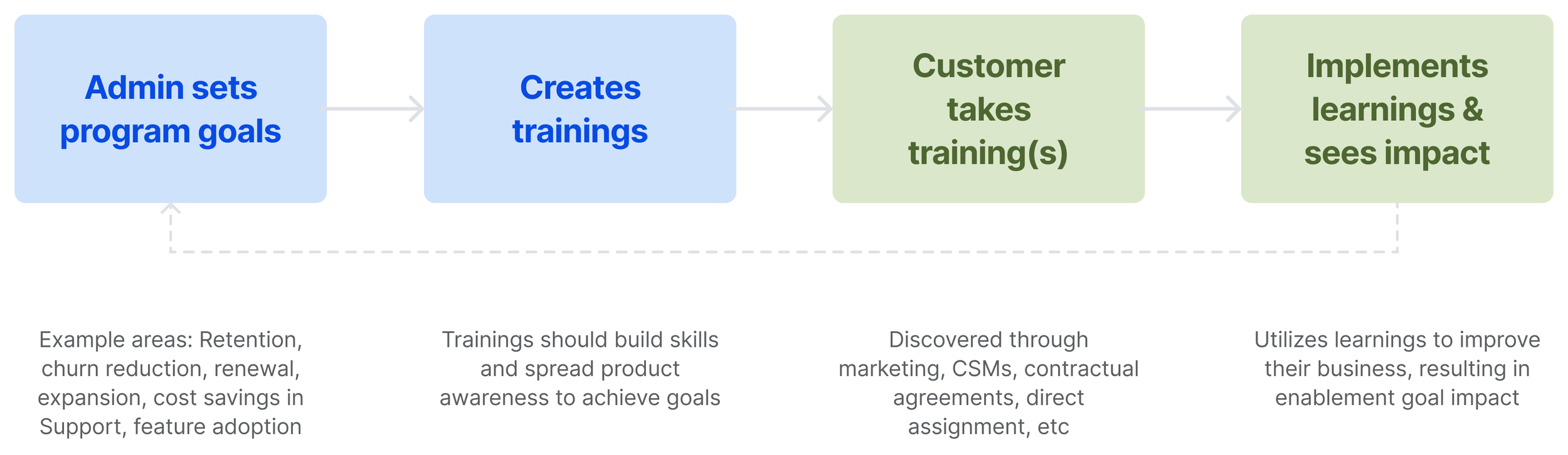
Generally speaking, Academies admins are often individuals or work in small teams. They juggle multiple roles and have limited time to complete labor-intensive, manual processes. Data fluency varies - some have access to data teams and BI tools, while most manually calculate performance in tools like gSheets or Excel.
For this project, we focused on admins relying on in-product reporting tools to export & manipulate data, which was the majority of customers.
Identifying friction in the reporting experience
I conducted comprehensive research to understand the state of reporting and user needs. I analyzed feature requests, audited the existing experience, explored competitor offerings, ran an internal brainstorm with cross-functional team members, and interviewed customers.
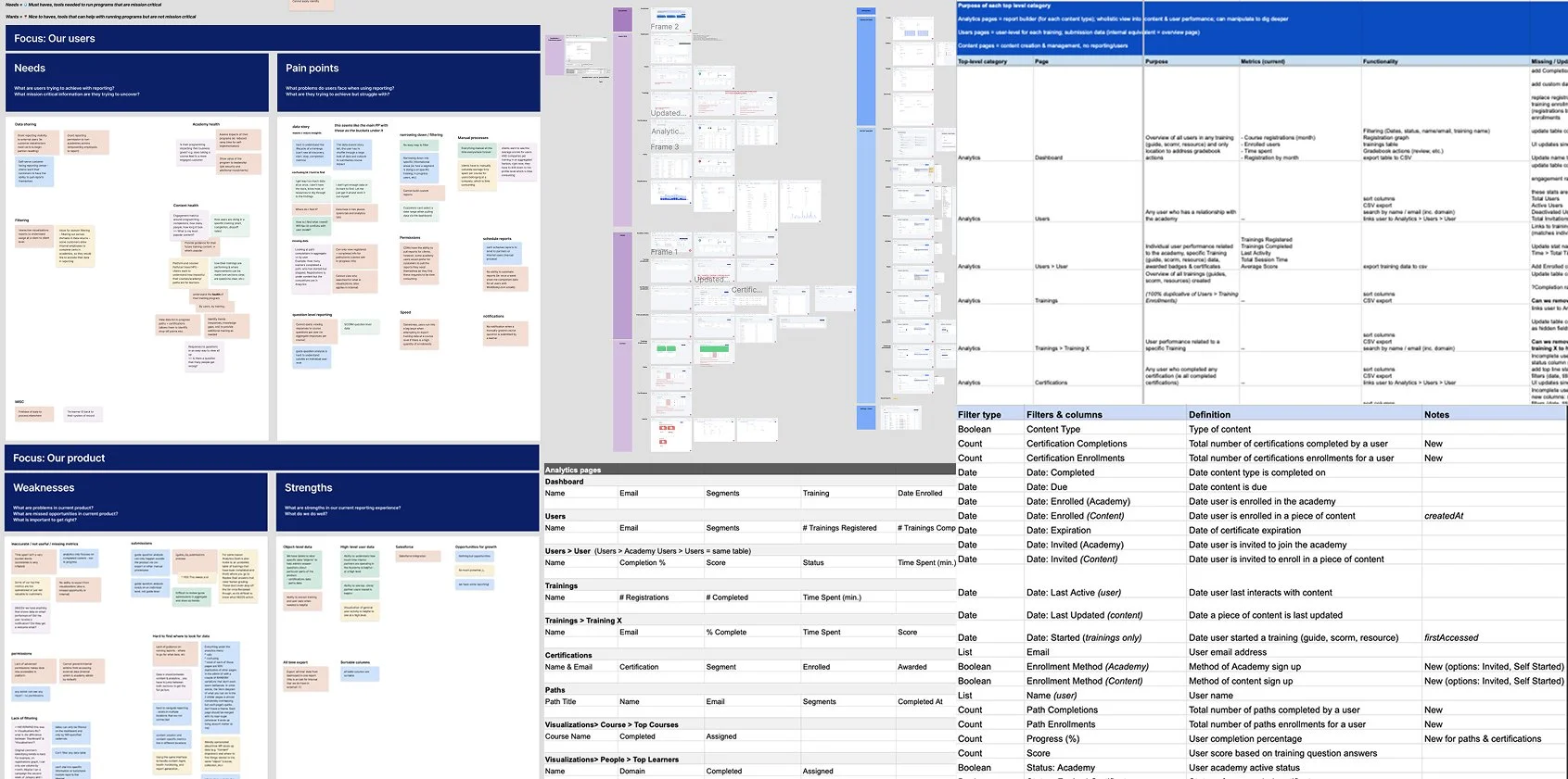
Research artifacts
Through the reporting research, 3 overarching needs kept surfacing.
Admins need to
demonstrate the value of enablement programs to stakeholders
assess learner performance to track content effectiveness
share data easily with their clients or stakeholders
Admins want to answer these questions
What is the impact of enablement training on business goals? EG: Does taking a course lead to a more engaged customer, reduced ramp time for self-implementation, etc.?
What is the status of content health? They want to identify trends in a few key areas:
Engagement - they look at completion rates, how many users took a training, how long it took, what content is popular
Performance - they look at start date, stop date, completion status, to analyze drop off and where potential question/content improvements lie
Learner impact - they want to know how impactful trainings and the Academy overall are for learners
Key experience issues
Most pain points clustered into three key areas that blocked admins from getting what they needed out of the reporting experience.
Incomplete narrative
Admins need macro to micro insights, but the product lacked meaningful insights across the user journey making it difficult to understand performance.
Examples: Missing metrics and data: submissions, events, cohorts
Example artifacts tracking data inconsistencies and missing metrics
Inconsistent data
Admins also struggled to find the data because key metrics were spread across multiple pages—with inconsistencies, like varying terminology, and gaps, like missing metrics. It made the data difficult to trust, analyze, or even find—leading to confusion and wasted time trying to piece things together.
Examples: Data spread across multiple pages, terminology and column ordering are inconsistent

Examples of data inconsistencies and gaps
Time-consuming workflows
Because reporting lacked key capabilities, admins were stuck in time-consuming, manual workflows to answer simple performance questions, like completion rate.
Examples: Limited filtering options, and exports do not capture filters, requiring cleanup; unable to share data in-product
Admin workflow to create reports in legacy reporting experience
Put together, these pains greatly increased customer frustration and dissatisfaction, putting retention at risk.
Even prospective customers noticed these limitations and choose competitors due to the absence of in-product data manipulation tools, limited visualization options, and the inability to share reports with partners.
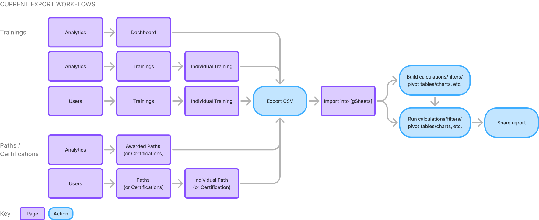
LEGACY UX WALKTHROUGH
As an admin, I want to see enrollments for a new training so I can understand performance.
As shown in the prototype walkthrough above, admins must visit multiple pages to download three separate CSVs. They’re then required to use a 3rd party tool to clean up and stitch the reports together to finally start getting insights for a single training.
If an admin tried to report on performance for a specific Path (another content type that groups trainings together), even less data was available. Data around learner progress was vague at best, lacked segment information, and was not filterable.
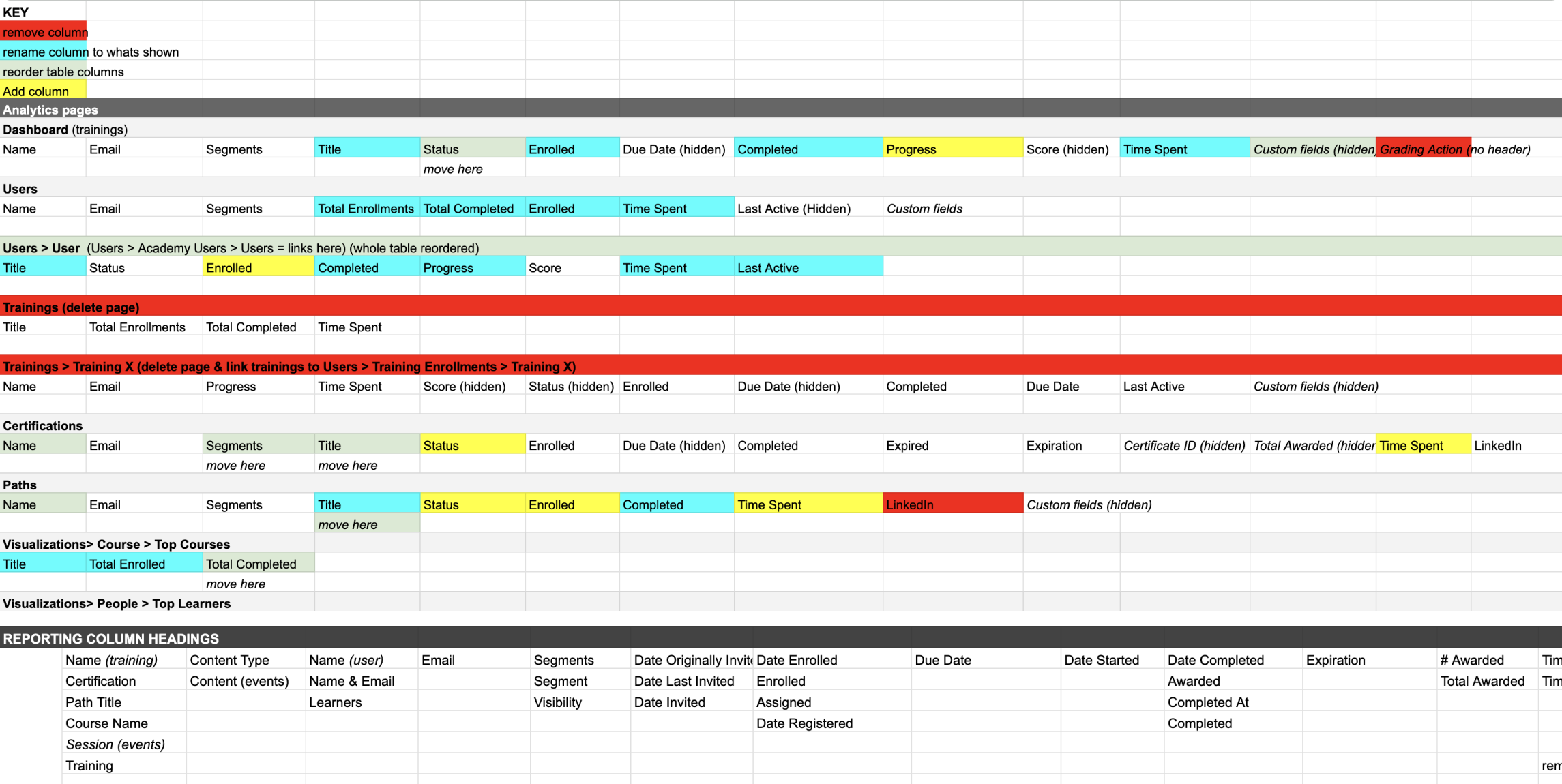
I documented all of the problems gathered in my research - broken out into effort and theme. Some were minor with a clear solution (eg. update column names to be consistent). Others required real feature work, like enable admins to create custom reports to send to their partners.
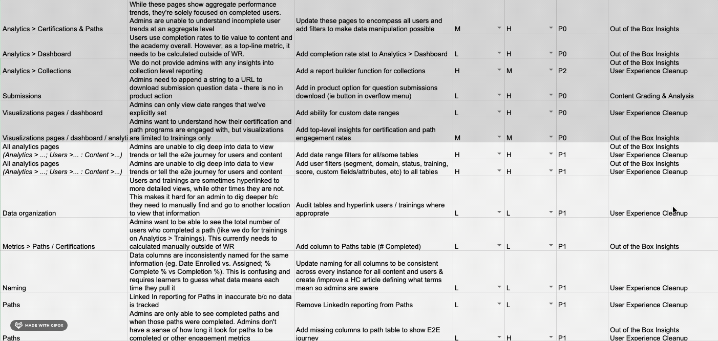
Problem matrix
Through discussions with the team, we determined that while there were many small quick wins, even added together, they wouldn't solve the key pain points for our users. Instead, we bucketed them as a separate epic to be tackled when the team had down time. I led that design work and management of the backlog.
Problem by page and impact
SOLUTION
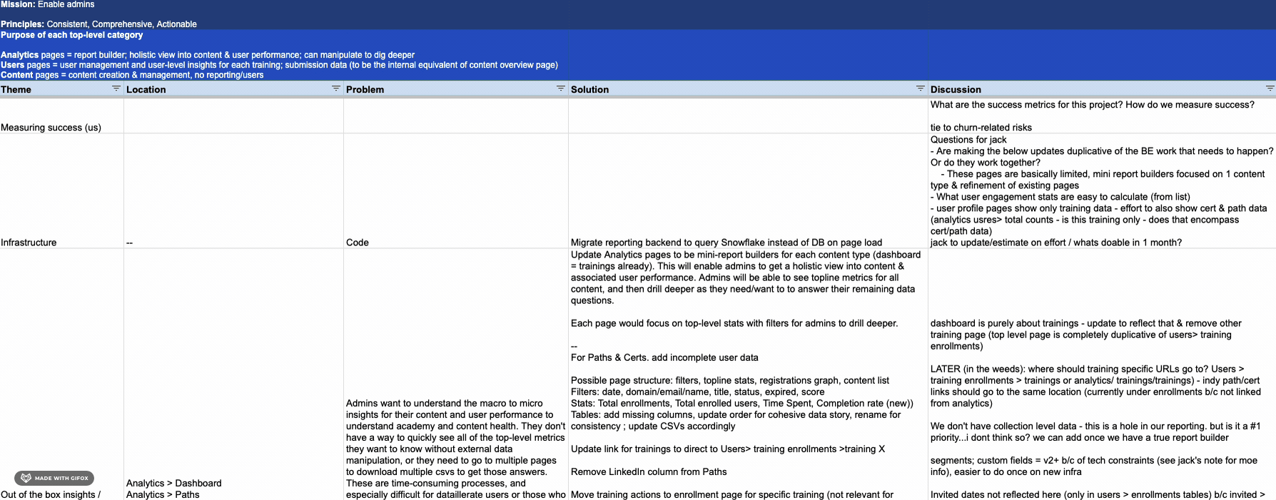
Create a flexible report builder to provide admins with comprehensive and actionable data, enabling them to dive deeper to understand end-to-end performance and share insights with stakeholders.
Given the widespread pain around reporting, the scope focused on developing a custom report builder. This was where admins felt the most friction, and we saw the greatest opportunity to drive impact—not just in satisfaction and retention, but also in staying competitive and laying the groundwork for future reporting features.
The goal was to give admins direct access to their data in a flexible, intuitive way—so they could answer key questions and uncover insights to show program value. By enabling custom reports, we aimed to cut down on manual work and make it faster and easier for teams to get the answers they needed.
Stories that shaped the solution
Reporting should empower admins to
analyze academy performance to assess impact on business goals
see the macro to micro user journey to understand content performance
easily share data with their clients or stakeholders
As a result of these needs, two user stories guided the design process.
1. As an admin, I want to see enrollments for a new training so I can understand performance.
The first user is Gabe, who is an enablement manager at Friend Co. He wants to report on everything! But right now, he's looking for insights into enrollments for a newly launched course: Advanced Personalization Introduction. With the current experience, he struggles to find the data he needs, and spends much time stitching reports together, filtering the dataset, and building graphs and pivot tables just to track and compare performance.
Goal: How many people are taking the new course to understand performance
He wants insights into enrollments, status, completion rate, and score. He plans to compare enrollment month over month and performance against other courses.
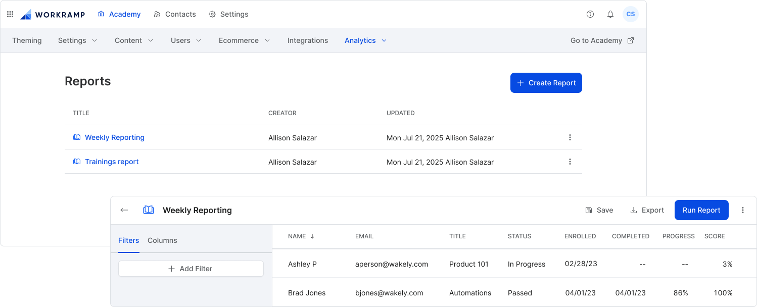
Click through this prototype to see how Gabe would build a new report using the new report builder.
He would take the following steps to create and save the report
Click +Create Report
Add Time spent column
Filter by the training title (Advanced Personalization Introduction)
Run the report to confirm the dataset
Edit the report name and then save it
Export report
2. As an admin, I want to create and send a report to a client, so they can understand how their users are performing.
The second user is Priya, an enablement manager at Wakely. She's responsible for making sure clients can track their employees progress in contractually required trainings. To do so, she sends 60+ reports to clients weekly. Prepping the reports takes over five hours a week. A major pain point with the current experience is the lack of segmentation filters, especially for Paths. She's required to download multiple reports, separate by cohort, and then send that to clients. Not only is this time-consuming, but unsustainable.
Goal: She needs to create a report to send weekly to a new client Orion, so they can report on user progress in the required role-based Paths to ensure the contractual agreement is upheld.
She wants Path insights into status, enrolled and completed dates, progress, and segment.
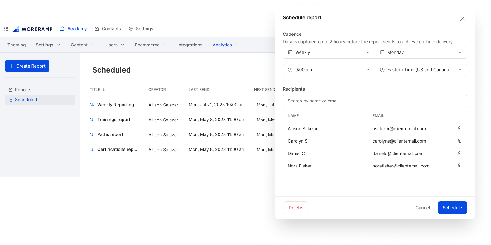
Click through this prototype to see how Priya would create and send a report using the new report builder.
She would take the following steps to create and send the report
Duplicate the template report: [Template][Customer Name] - Learning Path Completions
Edit the report title
Update the segment to be Orion
Run the report to confirm the dataset
Save the report
Schedule the report to send weekly on Monday at 8am to the contacts at Orion and their Wakely CSMs
Trade offs
Gradebook vs. Report builder
We explored building a gradebook to improve quiz submissions reporting—an area with no in-product tooling or analytics. At the time, admins had to manually access a hidden URL to download a CSV, which often failed for large datasets.
However, since quiz submissions were only used by a subset of admins, the gradebook’s impact would be limited. Instead, we prioritized broader value by improving CSV accessibility and content: adding in-product download buttons, per-training exports, and richer data fields to ease reporting pain points without full-scale feature development.
API vs. in-product tooling
“We use the API to connect Salesforce because the tools in WorkRamp don't meet our needs. It requires lots of look ups for IDs and managers because the data isn't available in the product.” - Skai
Early on, we debated whether to invest in API-based reporting. While some customers use it heavily, most don’t have the setup or resources—and rely on in-product tools. Prioritizing the API would’ve left the majority underserved.
Since we were also losing deals to competitors with stronger native reporting, we chose to focus on improving the in-product experience to better support admins and increase their satisfaction, and remain competitive in the market.
Quick-wins vs. Snowflake migration
Our initial goal was to scope improvements to a quick win project without re-architecting our backend. However, during scoping discussions, we realized we could not fulfill some key capabilities like filtering on segments, without investing in migrating the reporting backend to Snowflake.
Additionally, a long-term engineering goal was to run all reporting in both platforms on Snowflake, which provided more flexibility for complex filters, and optimized performance. Choosing to invest in a migration would dramatically increase engineering scope.
Ultimately, it was decided to go forward with the migration. It was recently completed in the internal platform, so there were database structures to work from, which would help the team move faster. The long-term upgrade was worth the additional time spend. We cut scope from the MVP to support this additional work.
MVP scope
Ultimately, the vision scope was large. To incrementally deliver value to our users, we prioritized the foundational elements for the MVP release, which included a database migration to snowflake, updated report builder UX for trainings only, robust filtering, including conditions and segments, customizable columns, and exports that reflected the filtered dataset.

We also knew that, at this time, we couldn't support every stage of the reporting journey, because the foundation in our product needed to be built first. While we would have loved to keep admins in product for every step, for now, admins would still be required to manipulate data externally, but were now equipped with the tools to get them there faster.
The investment to build a solid reporting foundation was necessary to expand reporting capabilities, solve top pain points and increase customer retention.

MVP report builder
MVP launch
The first iteration of the report builder launched in October 2023. It was received well by customers.
“We have started using the reporting piece and so far it’s fantastic! Love that we can segment the data down even further to get a smaller size of information to upload on our end.”
Tyler, DriveCentric
Goal attainment
We achieved our primary goal of increasing customer satisfaction and retention. As a result, the MVP report builder
Closed 80% of top 10 feature requests and solved ~90% of legacy reporting issues
renewed contracts with multiple customers, including an extension directionally resulting in $500k+ ARR
launched with a customer case study from an early access user
Post-release launches
To retain top-paying customers, we needed to deliver on the promised work of saved and scheduled reports. The subsequent work was broken up to incrementally deliver value, increasing customer satisfaction with each release, while also balancing the need to focus on other features outside of reporting.
Jan 2024 • Path & Certification reports
Added missing Paths and Certifications (two additional training types) data to enable full end-to-end reporting on all training data. This was also a requirement for saved & scheduled reports so admins could report on and share all data. The update also included new certification-specific filters and columns.
Apr 2024 • Saved reports
Enabled admins to save custom reports. As a result, added a report management page and updated the report builder navigation UX & UI.
Saved reports and updated report builder navigation
Jul 2024 • Scheduled reports
Reliant on saved reports, included adding a sidebar to the reports experience to navigate between pages. The Scheduled page is a pre-filtered list of all scheduled reports displaying important schedule information including next and last sends.
This introduced a new system pattern: the sidebar. It would also be used in CMS, Communities, and learner search. I utilized the sidebar to have the option of expanding the pre-filtered page offerings (like starred, my reports, trash, etc.), have a location to add report search, and in the future, support folders for better organization.
Oct 2024 • Event reporting
Net new reporting on event attendance, across all events. Report included event-specific columns and filters.
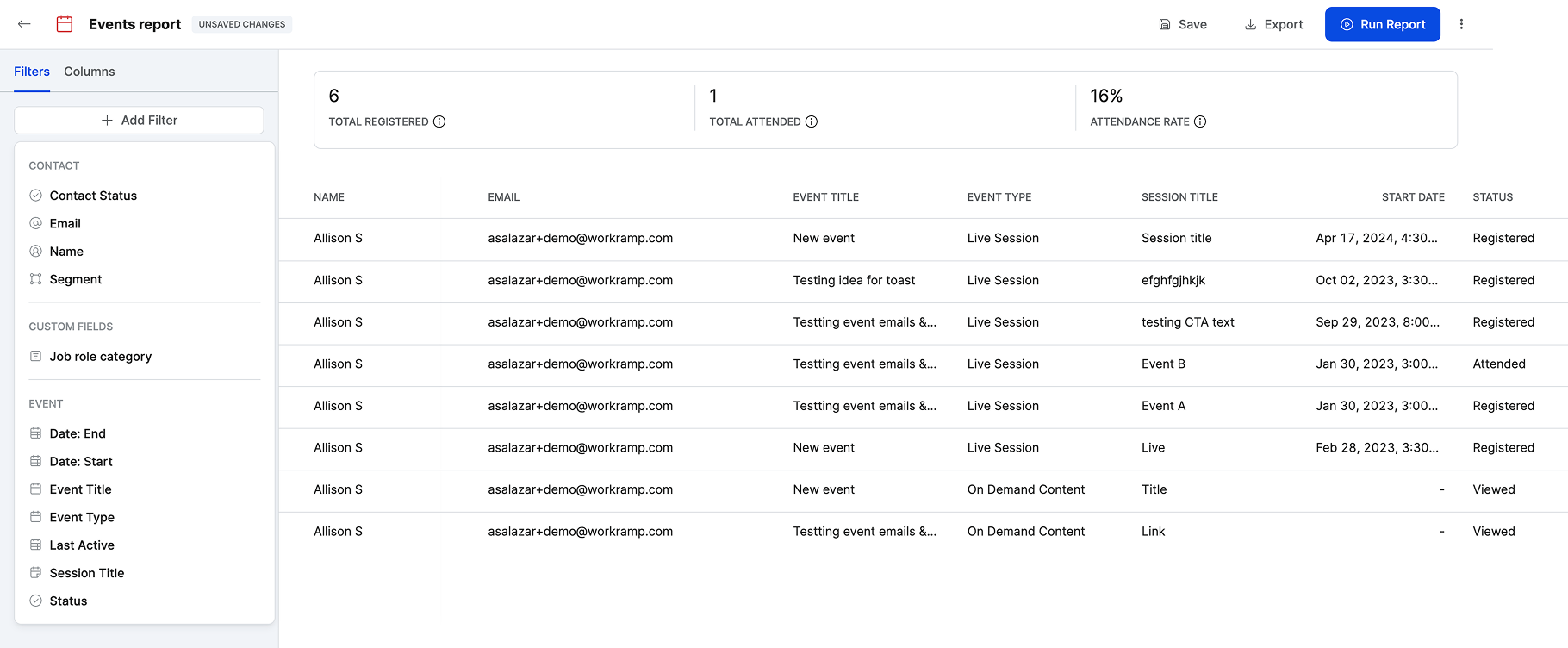
Events report and filters
Dec 2024 • Contacts reports
Aggregate reporting on user behavior, including total counts for courses enrolled, completed, and per content type. Dataset focuses on engagement with an Academy, compared to training-specific data in the Trainings report.

Contacts report and filters
Dec 2024 • Top-line aggregate stats
Key metrics for each report type (trainings, events, contacts) that dynamically update based on selected report filters.

Aggregate stats for each report

Props for report builder work, including personal feedback from an engineering partner
Learnings
We might have considered leveraging 3rd party tooling instead of building natively. Maybe this would have helped us move faster, but maybe not. I think we were tunnel visioned on building natively that this wasn’t considered, and maybe it should have been. If we were really ahead of the curve, we should have considered how AI might have impacted the experience.
With added scope of the migration and new UX, we should have tried to find additional ways to descope the MVP to release it sooner. For example, we probably could have removed filter conditions, and built it as part of the next release.
The engineering team had invaluable knowledge around the complexities of the legacy reporting code and really helped me understand the nuances we needed to consider. It was a true #oneteam (a WorkRamp value) effort to build this and stay motivated on a long-tail project.