Developing a design system
Establishing and building a reusable component library at Teachable
Problem
When I first joined Teachable’s Product Org in June 2017, I discovered that there was no system or consistency used for designing and building pages within the app. Not only did this lead to confusion and increased output time for designers but also increased engineering development time. Additionally, the lack of consistency creates a poor UX/UI for our users and diminishes the value we want to deliver to our users.
Solution
Create an admin design system that ensures consistency in pillars and components to increase designer speed and consistency, and create a more efficient handoff for engineers.
My role
Audited, built, and organized the first version of the design system.
The challenge
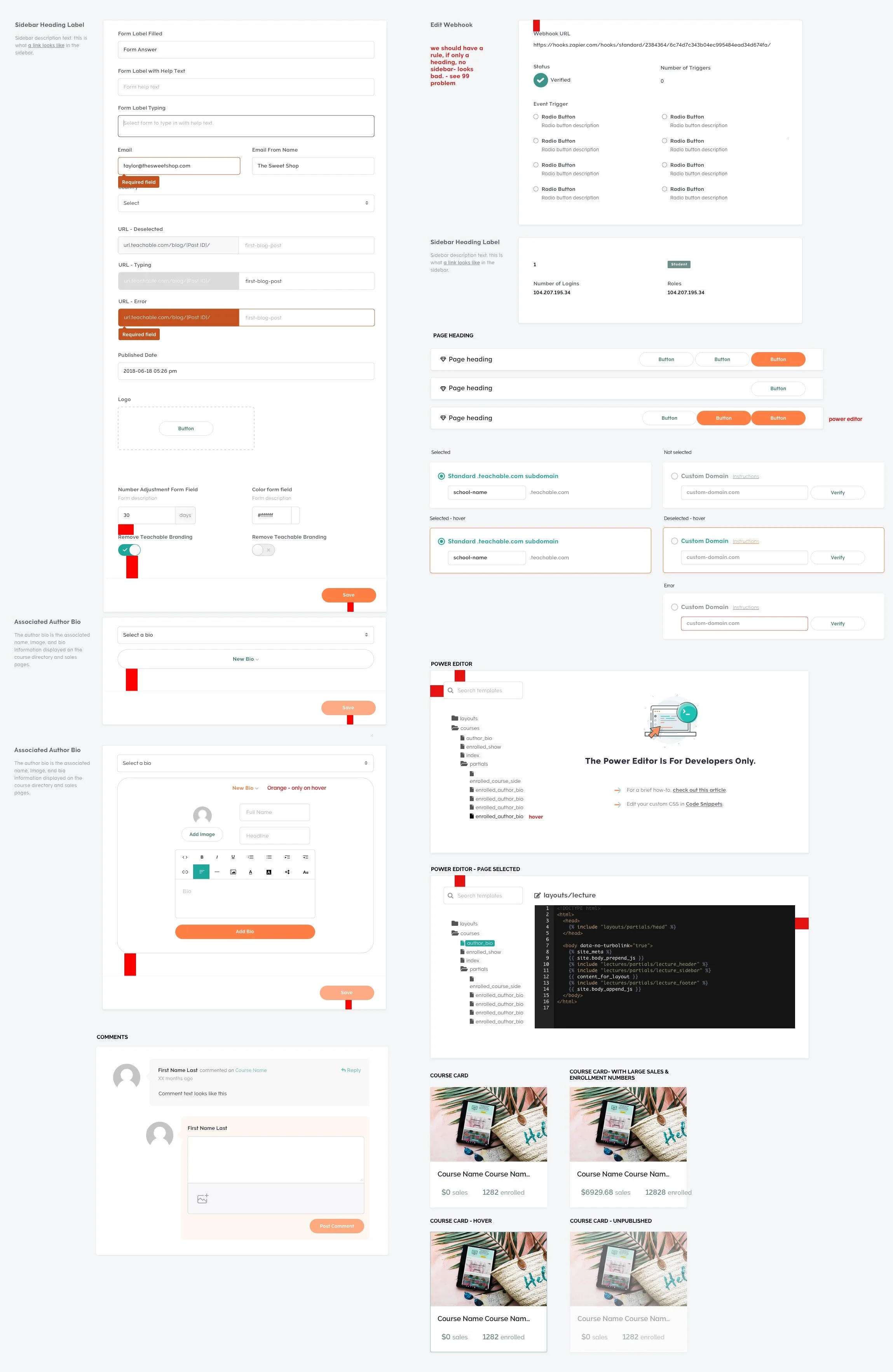
Auditing a complex and expansive product
The biggest challenge for this project was auditing the entire app for pillars and components while defining what they are and what they do. Without following a design system or style guide over the last 3 years, our UI was extremely inconsistent with styles often overwritten. This audit required a deep dive into every page.
Partnering with the other product designer, we broke up the components to audit and document. We went through each screen and documented all component states, styles and use cases in Sketch.
There were a lot - just check out the variety of greys...

That is 70+ greys and counting…


A few relics of the original audit.
Defining our Pillars
Typography, colors, spacing and grids
As a team of two designers, we had limited time to devote to building fully fleshed out design system.
Our goal for this first iteration was a tool that was lightweight and covered our most basic design needs: pillars, atoms, and molecules. It was not a time for a full visual redesign but rather a time to define consistency within our product in its current visual state and update components to fit design best practices.
To start, we explored other design systems for examples and referenced Brad Frost’s Atomic Design Methodology.
We started by defining the type scale, color scale, and spacing/grid ratio. These outcomes influenced the updates we made to components going forward.
Typography
To start systematizing our type scale, we set our base font = 13px and used 1.125 font ratio with a line height ratio of 1.5 (rounded to the nearest 4px).
Colors
We condensed our color palette into a singular grey scale and added in additional hues for our primary and secondary color palettes.
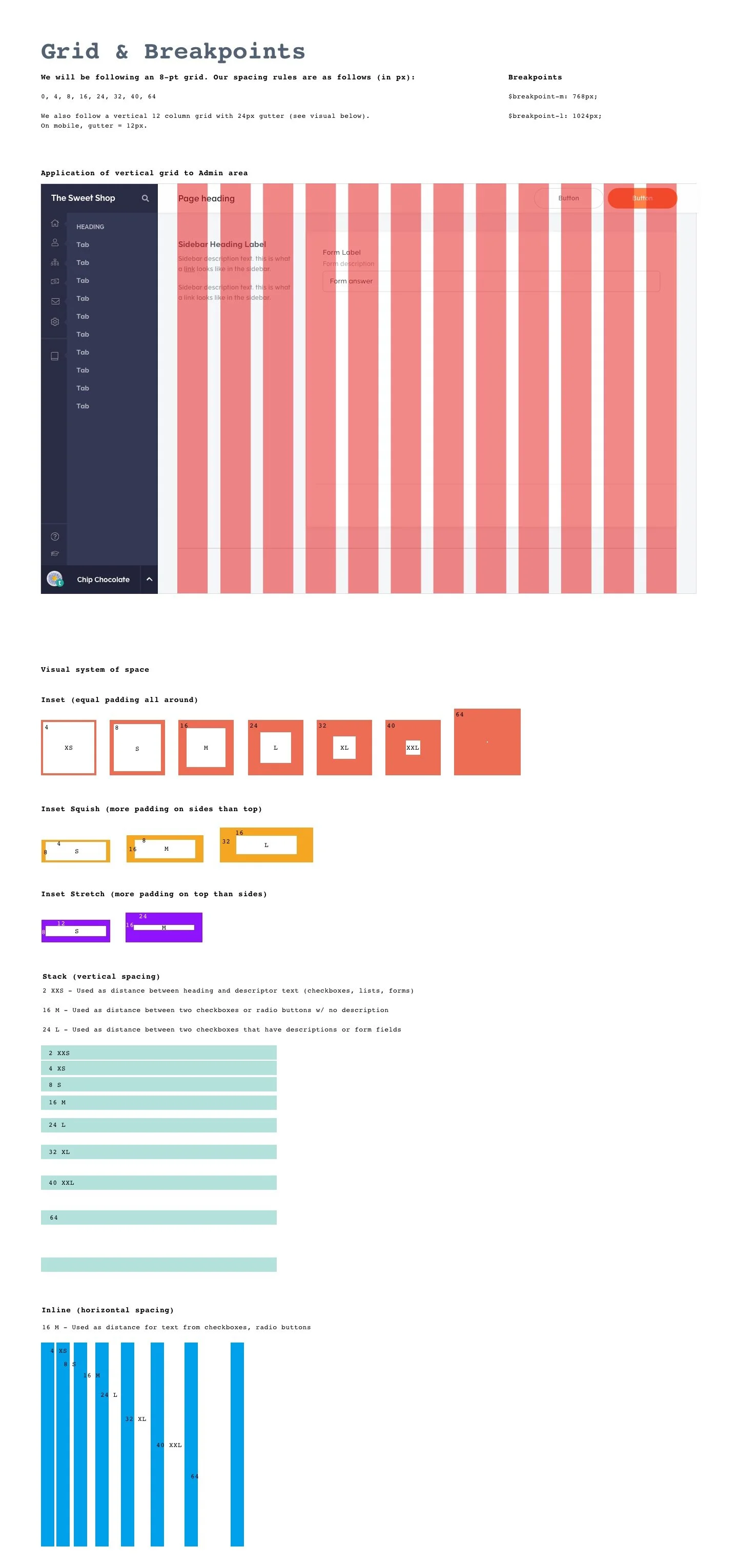
Spacing and grid
We defined an 8pt scale with the values of: 0, 4, 8, 16, 24, 32, 40, and 64px.
For the grid, we used a 12 column grid with 24px gutter for desktop.


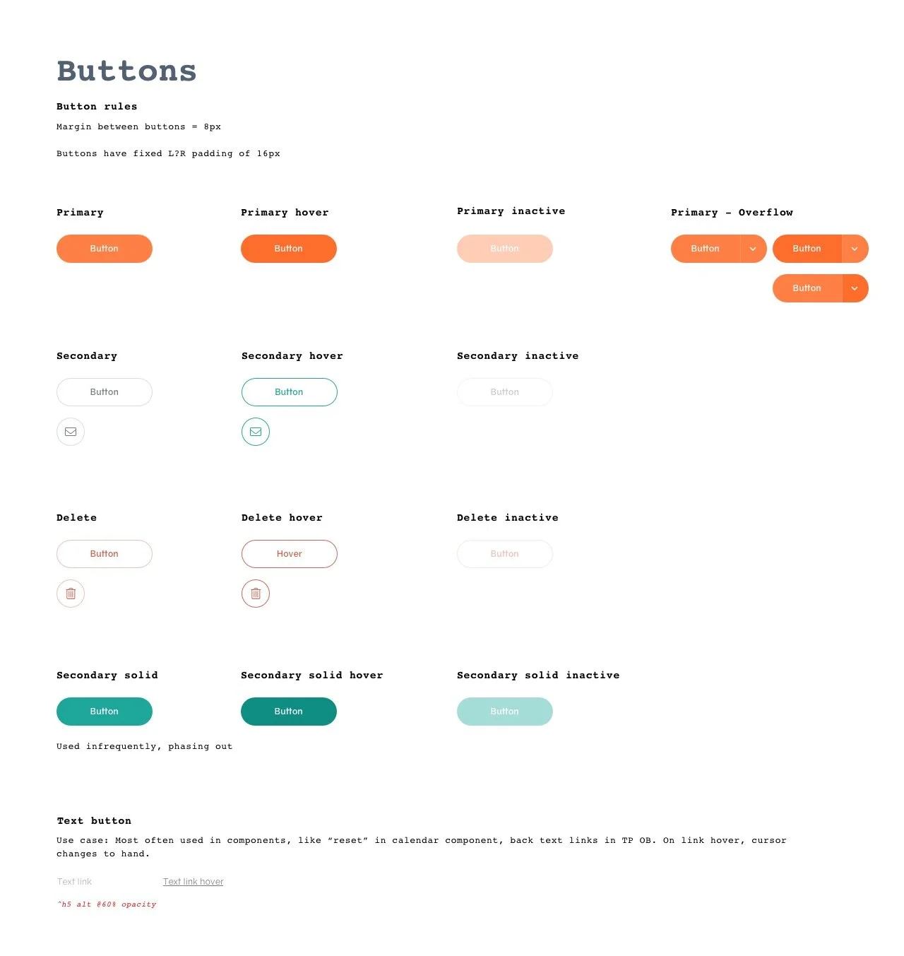
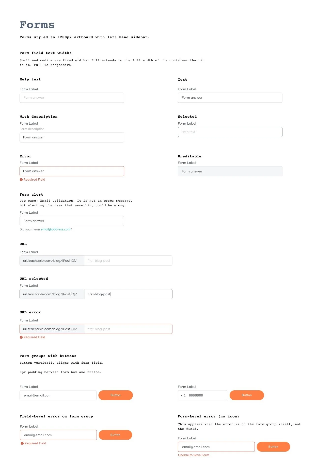
Atoms and molecules
Updating components to use our pillars
We updated our components to fit the new pillars, and created a reusable pattern library in Sketch with versioning through Abstract.

Lessons learned
With a small design org and a growing engineering team, our time and resources to dedicate to this project were limited. Looking back, I wish we were even more stringent in cutting and simplifying pillars and components.
Additionally, I realized we should have added more detailed documentation. Since the other design team members and myself had been building this system and had a deep understanding of the product, it was easy to achieve surface level documentation. But as the team grew, the lack of documentation made it hard for new designers to understand the system and application of components.
Next steps
We unfortunately did not have the bandwidth to apply this system retroactively, but could only use it with new designs. Conveniently, this design system project coincided with a front-end initiative to start rewriting our app in React. As we built the design system, our front-end team built a reusable React component library in Storybook. While it did not include every component, it became a starting point for both teams to work faster and more consistently.
In September 2019, the design team grew from 2 to 6 designers. Since then, it has been a team-wide effort to take this basic system to the next level. We’ve systemized our type scale even more, and decreased the number of styles to 7 headings and 3 body sizes. We’re actively working with engineers to apply the type updates everywhere in the product and implement systems fonts across the interface. We’ve updated our grey-scale palette to be a consistent tone, and we’ve updated all colors to pass accessibility standards.
Up next - getting the rest of the pillars into the React library and interface along with rebuilding and implementing our top-used components: buttons, forms, tables, and modals.

